Site Redesign May 2012 part 2: Styling HTML5 search inputs and little icons

Haven’t written about this for a while, but I’m still working on it!  Here is the GitHub repository, and here is the progress.

I decided to use the new HTML5 “search” input type with a placeholder.  I think it’s neat – in Chrome and Safari, when you type something, there is an “x” added you can click to clear the text.  Placeholder works in my Chrome, Safari, Firefox, and Opera, but not IE (was not surprised).  I wanted to center the text in the search box, but “text-align: center” didn’t seem to affect the placeholder text for Safari.  I found a “::-webkit-input-placeholder” selector, but unfortunately, “text-align: center” on the placeholder text specifically still didn’t work.  It was odd to have the placeholder text left-aligned, but the text typed in centered, so I decided to just leave the text left-aligned.

It was also pretty annoying trying to style the input box in the first place, because nothing seemed to affect the style in Chrome or Safari.  I found a Stack Overflow question that was pretty enlightening: HTML5 Search Input: No Background Image in Chrome?  Apparently, the browsers that support the “search” input type (WebKit – Chrome and Safari) apply their own special styling, which is not currently accessible.  The other browsers don’t support “search”, so they just style the input like normal “text” types.  A solution in the answers was to use “-webkit-appearance: none” to clear the default styling.  Worked for me!

Also made my little icons and author icons into sprite sheets (except the search ones – I think you won’t be able to see the second search one because it’s black), plus a favicon (look up)!


I think I’ll be editing the third (largest) layout version, based on feedback.  Not sure what I’ll do yet.

Site Redesign May 2012 part 1: My approach

I’m finally redesigning this site!  I’m putting it on GitHub for version control, but also because I think it’s neat to be able to learn from others’ source code.  Here is the repository.  In addition to fully commenting everything, I’m keeping notes on sites I find really useful while I’m working on this.

I’m attempting a responsive design (read Responsive Web Design!  It’s awesome).  I’ve decided to do basic layout structuring for three different layouts (small, normal, big) in stand-alone stylesheets first, then build up with media queries from the small one to the big one (my attempt at mobile-first).  So far I’ve done the normal and the small.  Next is to do the big layout, then combine them into one stylesheet with media queries so it’s actually responsive.  Then, add real styles instead of this ugly temporary yellow boxy look.  And finally… the part I’m unsure about… is integrating this with WordPress.  We’ll see!

I really like Media Queries, which is where I’m getting a lot of inspiration for responsive designs.  I’ve taken to resizing nearly every site I come across now, to see if it’s responsive.  That’s how I found the awesome little detail on CSS-Tricks – the narrower the width, the more worried the frog gets!  See for yourself!

I also wanted to note that HTML5 Boilerplate is awesome.  I’m not using it, because it’s a little too full-featured for me (I want to learn and start from the basics on my own instead of using a whole pre-built structure right now), but the comments in it are so useful and great to learn from.  I’m starting reading source code a lot more lately.  Which reminds me, I remember back when I was playing around with websites in middle school, there was that trend of disallowing right-click so that people couldn’t “steal” images or source code…  Things have changed so much now, there are even ads in source code!  Check it out – look at this source code of Blacktie.  I have no idea what that site is (I found it through HTML5 Gallery), and I found that source code ad on accident, but I think it’s awesome despite the fact that it’s an ad.  It’s an interesting way to get to your target audience!

Responsive Web Design by Ethan Marcotte

I finished this book a few weeks ago, but never got around to writing about it.  I loved it though!

Ever since I came across the idea of responsive design, I’ve been fascinated with it.  I just think it’s such a neat idea, and it seems so obvious after you hear about it.  After I finish the Infinite Parallax experiment I’m going to make a responsive layout for BaconFriedRice!  Yes, two years later, I’m finally going to actually work on it! (For real!)

Anyway, Responsive Web Design by Ethan Marcotte is amazing, especially because it is written by the guy who came up with the idea in the first place.  Just like all the other A Book Apart books, the writing tone is awesome, and the content tells you things you can do to create a responsive site right now.  He shows you how to do it by creating an example page that you can actually go view and play around with.

One thing I really like that Marcotte says is that a web designer’s canvas is the browser (page 3).  However, unlike other art mediums where the canvas is precisely selected beforehand, the browser continually changes, and you can’t rely on a consistent format, which make web design pretty challenging.  I’ve never thought of it that way before, but now I view it all in a whole new way.

Marcotte sees three ingredients of responsive web design, and breaks up the chapters accordingly: 1) a flexible, grid-based layout, 2) flexible images and media, and 3) media queries (page 9).  I won’t go too much into exactly what he says in the book, but I found it extremely helpful.  He breaks down the steps he takes to make a layout responsive, which makes it pretty easy to follow, and it seems like it’s not too hard to break into creating responsive designs.

Basically: read this book!

Also, he made an “over 9000” joke :) He put comments above some media query breakpoint examples: “Default, linear layout”, “Small screen!”, “Desktop”… and “IT’S OVER 9000”!

Just read it!

The book that started it all: How I taught myself HTML in 4th grade

I got my new book HTML&CSS in the mail yesterday.  It’s a very basic introduction to HTML and CSS, but I got it even though I know both because it is absolutely gorgeous.  I wish more books taught like this – I’ve actually been searching for more books on web design like this.

Anyway, as I started reading through it, I realized that a lot of HTML I thought I knew is obsolete.  For instance, apparently using <a name=”blah” /> is now obsolete in HTML5, and you should instead specify anchors for links with id attributes.  I didn’t even know you could specify anchors with id!  At that point I realized that my HTML is way outdated.

Why?  Because the HTML I know is what I taught myself from a book in 4th grade.  After this one semi-structured introduction to HTML, everything else I picked up as I needed it, and I definitely haven’t been keeping up with new specifications.  I have a very haphazard knowledge of HTML, with a lot of gaps.  Same with CSS – I don’t think I even bothered with CSS for years because that intro book never mentioned it.  I’ve definitely been able to get by with what I know, but I think it’s time for a more structured refresher – and to get myself updated to 2012!

I was surprised to find that I actually had that book from 1998 (14 years ago!) in my bookshelf.  I must have missed it when I was unpacking – otherwise I would have reminisced over it for hours.  Take a look at how awful it looks:
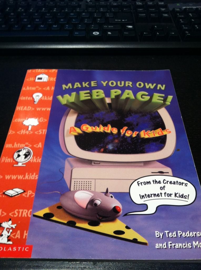
I got it from a book order in 4th grade.  Remember those?  I was always so excited to pick out new books to get.  I have no idea what possessed me to get this book, but I’m glad I did, because I’m pretty sure this book is the reason I’m a software engineer today.

Here’s the back cover.  I cringe just looking at that example site.
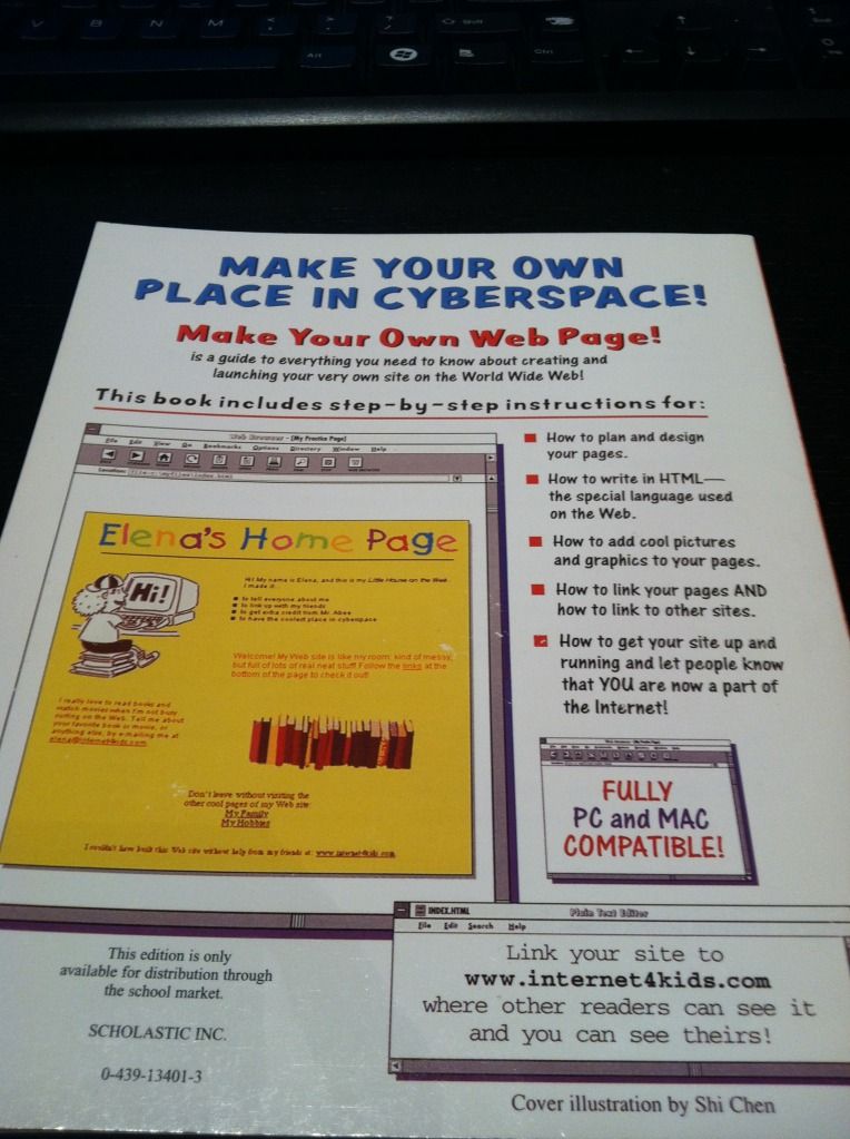
I’ve already checked, that website doesn’t exist any more.

I’ve been on a book-buying kick lately, mostly about web design.  I figure the money will be worth it in the long run since I’ll be learning something I have a lot of interest in, and I haven’t sat down and read for a long time.  I still have five or so fiction books in my bookshelf that I haven’t gotten to, but at this point in time I’m more interested in learning.  And reading is dying out!  Why don’t people relax and just read any more?  That used to be all I did when I was little.  Now instead of staying up really late reading I stay up really late browsing the Internet.

The HTML&CSS book is so pretty.
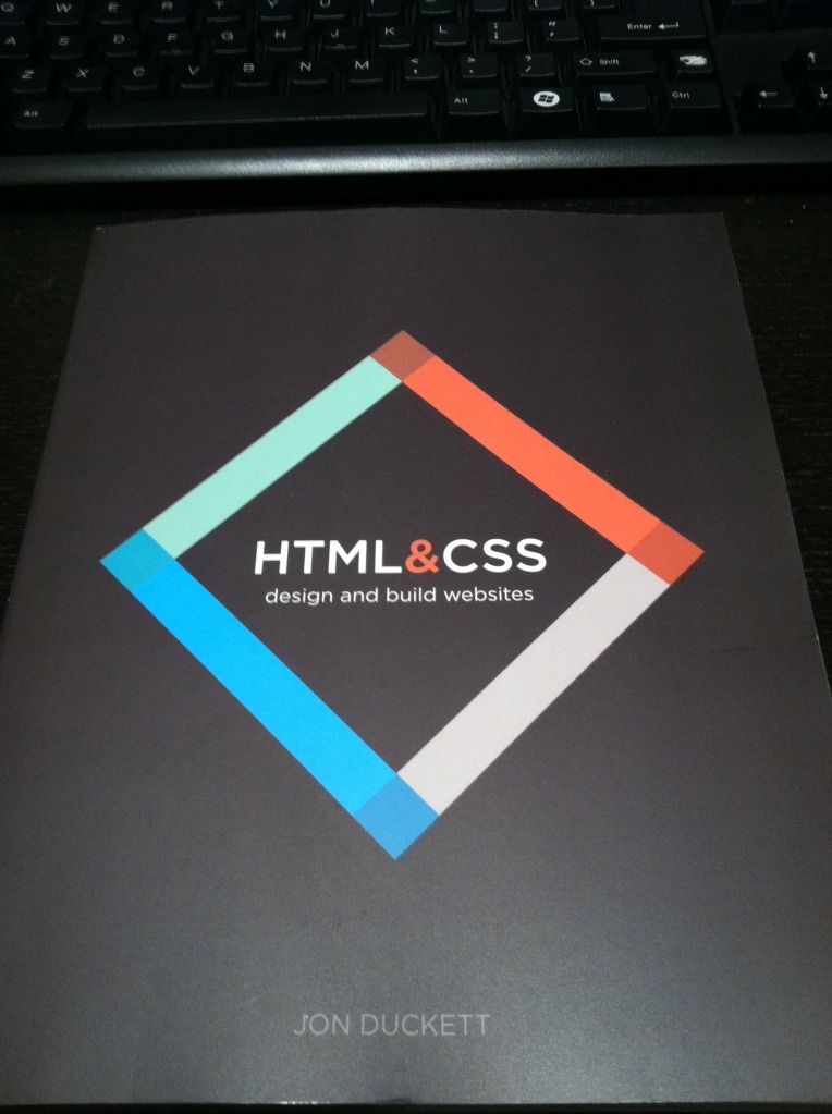
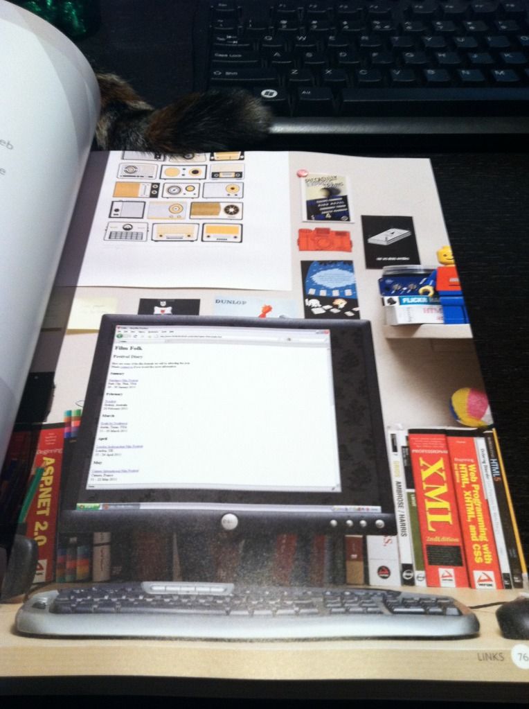
Even when they show the example pages that correspond with each code snippet, they don’t just show the page – they display them on different monitors in beautifully decorated rooms.  I’ve even been getting some book suggestions from the books they show in the background.
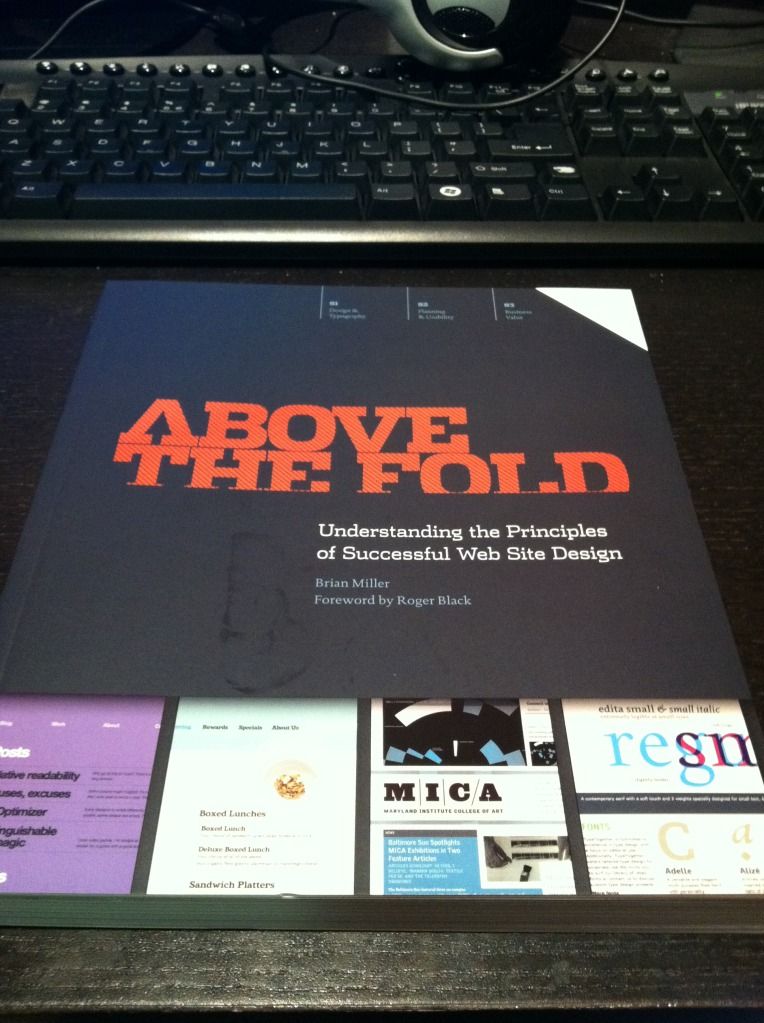
I also got Above The Fold a few days ago.  It’s also really pretty, and there’s a lot of fascinating background in it.  I never thought about the fact that tabbed browsing was based on file folders, although it seems obvious now that I know.  It talks about the structure of web pages, but it shows a lot of them full-length.  Web pages look so different when you look at them full-length versus the height of your browser.  They feel so much more cluttered to me when I see them full-screen – but then I guess that’s the whole reason the “fold” is important!
I’d also been reading The Design of Everyday Things before I got into this big book kick, because my user experience friend recommended it.  Before I started work on my current team I never thought about user experience at all – but now it seems so important.  I guess if I don’t have to think about the experience of doing something while I’m doing it, it was probably designed well enough that it was natural and made sense.  On the other hand, the book says that when something goes wrong, people tend to blame themselves rather than bad design.  I don’t think I believe that 100%, because some people are just retarded, but if the majority of people have difficulties, something is probably wrong.

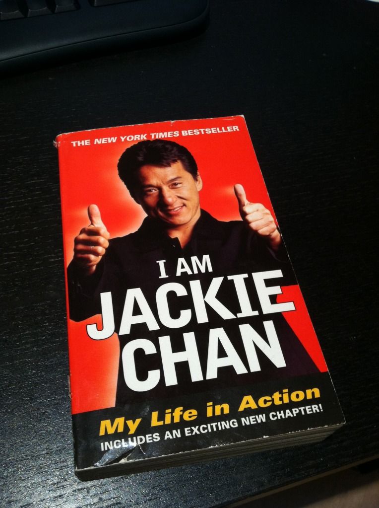
Another book I recently bought but haven’t started is a little different… I got I Am Jackie Chan, for no reason other than that Jackie Chan is awesome.  Sadly, I had to get a used book because they apparently don’t print it any more.
I’ve decided to set aside a specific amount of money each month for my “splurgy” purchases, and these books fall into them.  I’ve already ordered Responsive Web Design – now that people browse from phones so much a responsive site is pretty much expected.  Here are some other books I’ve decided to buy so far, in the order I want to get them:

After I read more I’m going to stop being lazy and actually design BaconFriedRice instead of using pre-made templates.  Yes, I’ve been saying that for a long time, but now that I’m reading all these I want to do it right.  I’m excited to get to that point!  Now off to read some more!

BaconFriedRice.com will be participating in Stop SOPA Day on January 18th

The SOPA Blackout site has a Javascript utility to pop up a message about SOPA on Stop SOPA Day, this Wednesday, January 18th.

The site has an interesting video about SOPA too.

Jack and I discussed taking BaconFriedRice down completely versus popping up the message, but decided not enough people visit the page for taking it down to matter… haha

Good reading: A technical examination of SOPA and PROTECT IP

New temporary theme

I was bored of the last theme. I still want to make my own, but I’ve decided to focus on other technical projects for now, so I’ve just chosen a new pre-made theme for Bacon Fried Rice. One day I’ll make one.

Edit: I may change it again.  This may be too girly for Jack.

Edit2: I changed the theme again.  Jack was being picky and didn’t like the colors of the last one.  Now this one is almost the exact same colors as the one we had before…

Inspiration

Just saw this on Reddit, and I’ve decided what my next crafts project will be to get me back into crafts. I’m going to cross-stitch a Monokuro Boo iPhone case! The Reddit post linked to this website, where you can buy iPhone cases made for cross-stitching. I’m excited! I already have a lot of leftover needles and embroidery floss from the crafts class I taught, so I don’t even think I need to buy anything other than the case. Next step is just designing the Piggy and Emo Piggy design!

Also, I’ve decided my next technical project is going to be forcing myself to REALLY make the new layout for this site.  I’ve said it for over a year and haven’t done it, but this time I REALLY am going to do it!  Really!

In addition I really need to make the author of each post more obvious… although I giggle every time I see the smiley face next to my name and the frowny face next to Jack’s :D

EDIT: Added Piggy and Emo Piggy tags because Emo Piggy was mad I didn’t tag her

New layout!

It’s been almost a year and I still haven’t made the PiggyFriedRice layout.  I’m putting this here so I see this every time and maybe get the motivation to make it.

Edit: Jack, I finally figured out where the stupid extra “–>” was coming from!