Site Redesign May 2012 part 2: Styling HTML5 search inputs and little icons

Haven’t written about this for a while, but I’m still working on it!  Here is the GitHub repository, and here is the progress.

I decided to use the new HTML5 “search” input type with a placeholder.  I think it’s neat – in Chrome and Safari, when you type something, there is an “x” added you can click to clear the text.  Placeholder works in my Chrome, Safari, Firefox, and Opera, but not IE (was not surprised).  I wanted to center the text in the search box, but “text-align: center” didn’t seem to affect the placeholder text for Safari.  I found a “::-webkit-input-placeholder” selector, but unfortunately, “text-align: center” on the placeholder text specifically still didn’t work.  It was odd to have the placeholder text left-aligned, but the text typed in centered, so I decided to just leave the text left-aligned.

It was also pretty annoying trying to style the input box in the first place, because nothing seemed to affect the style in Chrome or Safari.  I found a Stack Overflow question that was pretty enlightening: HTML5 Search Input: No Background Image in Chrome?  Apparently, the browsers that support the “search” input type (WebKit – Chrome and Safari) apply their own special styling, which is not currently accessible.  The other browsers don’t support “search”, so they just style the input like normal “text” types.  A solution in the answers was to use “-webkit-appearance: none” to clear the default styling.  Worked for me!

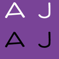
Also made my little icons and author icons into sprite sheets (except the search ones – I think you won’t be able to see the second search one because it’s black), plus a favicon (look up)!


I think I’ll be editing the third (largest) layout version, based on feedback.  Not sure what I’ll do yet.

Site Redesign May 2012 part 1: My approach

I’m finally redesigning this site!  I’m putting it on GitHub for version control, but also because I think it’s neat to be able to learn from others’ source code.  Here is the repository.  In addition to fully commenting everything, I’m keeping notes on sites I find really useful while I’m working on this.

I’m attempting a responsive design (read Responsive Web Design!  It’s awesome).  I’ve decided to do basic layout structuring for three different layouts (small, normal, big) in stand-alone stylesheets first, then build up with media queries from the small one to the big one (my attempt at mobile-first).  So far I’ve done the normal and the small.  Next is to do the big layout, then combine them into one stylesheet with media queries so it’s actually responsive.  Then, add real styles instead of this ugly temporary yellow boxy look.  And finally… the part I’m unsure about… is integrating this with WordPress.  We’ll see!

I really like Media Queries, which is where I’m getting a lot of inspiration for responsive designs.  I’ve taken to resizing nearly every site I come across now, to see if it’s responsive.  That’s how I found the awesome little detail on CSS-Tricks – the narrower the width, the more worried the frog gets!  See for yourself!

I also wanted to note that HTML5 Boilerplate is awesome.  I’m not using it, because it’s a little too full-featured for me (I want to learn and start from the basics on my own instead of using a whole pre-built structure right now), but the comments in it are so useful and great to learn from.  I’m starting reading source code a lot more lately.  Which reminds me, I remember back when I was playing around with websites in middle school, there was that trend of disallowing right-click so that people couldn’t “steal” images or source code…  Things have changed so much now, there are even ads in source code!  Check it out – look at this source code of Blacktie.  I have no idea what that site is (I found it through HTML5 Gallery), and I found that source code ad on accident, but I think it’s awesome despite the fact that it’s an ad.  It’s an interesting way to get to your target audience!