Wedding site part 1: Getting started

Now that we have a date and venue, I can start really working on our wedding site!

As of now there’s still nothing on it, just some piggies and a coming soon message.  However, we’ve decided to do a one-page site with fancy parallax effects.  I’ve never done anything like that before, so this will be fun.  The goal is to have it done by August 15th, so it will be ready when we send save the dates the next week.  (Assumed in that goal is that we’ll have save the dates designed and printed by then – we’ll see…)

I found some pretty neat one-page parallax wedding sites as inspiration:

  • Judy and Z – I like the way the navigation bar works in this one.  It starts at the bottom of the main section, then sticks to the top as you scroll down.  It also changes the color of the link to the section you’re currently looking at, so you know where you are.  Something I’m kind of iffy about is that in some sections, you have to click something to see more – if it’s one big page, I’d rather it’s consistently one big page you can scroll smoothly through, without needing to stop to get information.  I am going to do that for a photo section though – although it will at least give you a preview of some photos, and you can interact if you want to see more.  In the case of the Judy and Z site, there is no information in, for example, the “About Us” section unless you click.
  • Casper en Danel – I can’t read anything in this one, but I thought the the timeline section was neat, with the text and photos coming in from the sides as you scroll.  I feel there’s a little too much movement though; it takes half of my screen height for the text to finish moving from the edge of the screen to its final position, so my eyes have to move a lot to try to read.
  • Vince and Mars – This one is cute!  I like the parallax clouds/stars and change with your mouse.  I also like the cute header with the navigation under it; however once you scroll it kind of gets in the way.  On my screen, that header takes up half the height, so as I scroll I can only use the other half to see the content.  I think I would like to do something like this with a cute header and navigation underneath, except that instead of having the entire header + navigation stick to the top, only have the header stick to the top – kind of like the first site above (Judy and Z).
  • Julia and Artem – This one is also so cute!  I love the hot air balloon idea, and that it lands when you get to the bottom.  This one, like the Casper en Danel site, also has text fly in from the side when you scroll.  However, it’s much easier to read because when it comes in, it very quickly reaches its final destination while it’s still near the bottom of my screen, so my eyes don’t need to move as far (only up and down!).  I just also love that at the bottom, it says “Design by the bride, programming by the groom”.
  • Helen and Josh – So unique!  It’s kind of the opposite of the hot air balloon landing – you start at the base of a tree, and scroll up to “climb” it.  This one doesn’t seem as practical though, as it doesn’t have any actual wedding information.
  • Jess and Russ – The text was kind of small and hard to read, but I really like the keyboard and moves into place as you scroll.  I also like the letter that slides out of the envelope at the bottom for guests to enter and RSVP.  Something about the art made it a little creepy though…

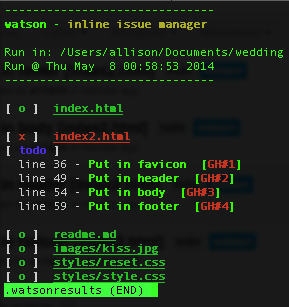
So now we’re sketching out ideas of what we want things to look like, and I’m also putting together a skeleton.  I’m going to keep everything on GitHub; I’m also going to take this opportunity to try using watson (apparently not capitalized)!  I found it a while ago and wanted to try it out but wasn’t working on any personal projects – you can add tags to your code, and it will pull them out and even add them as issues on GitHub!  I had a bunch of issues trying to get it working – I tried both the ruby and perl versions, and had a bunch of missing dependencies, things that weren’t high enough version, etc.  I finally got it to work though, and am trying it out now.

It’s kind of irritating for HTML because it takes the ending “–>” as part of the description of the tag.  It does specifically list that it supports HTML though, so maybe I’m just doing something wrong?  I’m also having trouble getting it to connect to GitHub, hopefully I can get that sorted out soon.

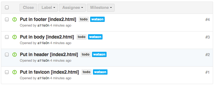
…and never mind.  Apparently the version I installed as a RubyGem was not the latest version.  Grabbed the latest version from GitHub and everything is awesome now.  I realized it when I tried to set my own tag format as described on GitHub, but my version said it was an unknown setting.  It successfully added my 4 todos to GitHub as issues!  Hooray!  This is neat.

watson

watson

Bonus: In the course of looking up parallax examples, I found Flat vs Realism.  I don’t know what to feel about it.

Site Redesign May 2012 part 1: My approach

I’m finally redesigning this site!  I’m putting it on GitHub for version control, but also because I think it’s neat to be able to learn from others’ source code.  Here is the repository.  In addition to fully commenting everything, I’m keeping notes on sites I find really useful while I’m working on this.

I’m attempting a responsive design (read Responsive Web Design!  It’s awesome).  I’ve decided to do basic layout structuring for three different layouts (small, normal, big) in stand-alone stylesheets first, then build up with media queries from the small one to the big one (my attempt at mobile-first).  So far I’ve done the normal and the small.  Next is to do the big layout, then combine them into one stylesheet with media queries so it’s actually responsive.  Then, add real styles instead of this ugly temporary yellow boxy look.  And finally… the part I’m unsure about… is integrating this with WordPress.  We’ll see!

I really like Media Queries, which is where I’m getting a lot of inspiration for responsive designs.  I’ve taken to resizing nearly every site I come across now, to see if it’s responsive.  That’s how I found the awesome little detail on CSS-Tricks – the narrower the width, the more worried the frog gets!  See for yourself!

I also wanted to note that HTML5 Boilerplate is awesome.  I’m not using it, because it’s a little too full-featured for me (I want to learn and start from the basics on my own instead of using a whole pre-built structure right now), but the comments in it are so useful and great to learn from.  I’m starting reading source code a lot more lately.  Which reminds me, I remember back when I was playing around with websites in middle school, there was that trend of disallowing right-click so that people couldn’t “steal” images or source code…  Things have changed so much now, there are even ads in source code!  Check it out – look at this source code of Blacktie.  I have no idea what that site is (I found it through HTML5 Gallery), and I found that source code ad on accident, but I think it’s awesome despite the fact that it’s an ad.  It’s an interesting way to get to your target audience!

Infinite Parallax Experiment part 1: Setting up

I’ve always loved the cute little parallax effects GitHub has on their site.  The three I’m specifically talking about are their About, 404, and 500 pages.  Aren’t they adorable?  These are based on mouse position, where a lot of the common parallax effects seem to be based on the scroll bar.

I showed this to my friend Rosemary a few weeks ago, and she mentioned that it would be cool if it there was even more of a 3D effect by moving you “forward” infinitely, so that whenever you clicked, the front-most layer disappeared, the other layers moved forward, and there were new elements in the back layer.  It’s been on my mind since then, so I decided to play around with it and make it a quick little experiment.

So far it’s also been a good chance for me to become more familiar with GitHub (and Git!) and jQuery.  I’m putting the source for this experiment in this infinite-parallax GitHub repository, and you can see what I’ve done so far here: Infinite Parallax.

It isn’t much yet.  So far I’ve just made a test background image for the landscape, and had the image move around based on the mouse position.  When the mouse is at the top of the window, it shows the top of the background image, and as the mouse moves down, the background image moves up, so that when the mouse is at the bottom of the window, it shows the bottom of the background image.  The x-movement is kind of arbitrary right now, as I don’t know what the final image will be, and it will probably need to be tweaked based on that.

My scribbly notes

My scribbly notes

Clicking on the landscape just pops up a temporary alert I put in the function where I will be manipulating the different layers of images.  I still have my test numbers in there, so right now the landscape is showing mouseX, mouseY, and the x-position of the background image.

Next step I’m just going to put in three layers of images and play around with the x and y positions to see how far to move them for it to look okay.  Then after that, putting in random images with some random movement offsets on each, and finally removing/moving/adding layers on click!

The hardest thing will be deciding what to theme this experiment and what images to use.  I took a look at my Inspiration Pinterest board, and I think I’ve decided to use the color scheme in this pin.  Maybe a foresty theme with trees and bushes that have purple berries, and some grey bunnies or something.  Who knows!  Rosemary also showed me how to “draw” (…or rather, trace xP) in Illustrator, so I think I’ll sketch simple cute little images and trace them in Illustrator.

My first (messy) tracings!

My first (messy) tracings!

Node.js experiment part 1: Defining my experiment

I’ve decided that my technical project will revolve around Node.js.  And now I will start my long convoluted story about how I came up with my project…  I guess I will provide a table of contents again since I tend to ramble a lot :)

The back story
The idea
The goals
Future considerations
The plan

(I just want to say here that I accidentally deleted a whole bunch of stuff I wrote and WordPress didn’t auto-save a draft before it happened so now I am an extra sad panda.)

The back story

At work, I was working with part of our team in China, and right before the winter vacation they gave us the code to a web socket server in Node.  I’ve always been interested in web technologies – I taught myself HTML from a book in fourth grade and self-taught whatever PHP I needed in middle school for my embarrassing (and luckily now-nonexistent) EatenCheez.com – but I’ve never had any formal training.  After I moved to Virginia in high school, I stopped playing around with HTML and PHP in my free time, and since I focused on embedded systems in college, I don’t really have any idea what Node was.  I was curious, so I looked into it, and it’s so fascinating!  A web server written in 6 lines of code?  Awesome!

(Side note Easter egg – I found a snapshot of EatenCheez.com from 2003.  I don’t know what happened to the formatting but I thought it was a funny reminder of way back when.  Cliques, rings and clubs?  Guestbooks?!  At least this version of EatenCheez.com didn’t have a splash page with the obligatory hit counter!)

I started looking into Node, reading about what it’s best used for and following some cool tutorials.  I even installed Ubuntu on my Windows desktop just to be able to play with Node easier.  There are some really cool tutorials and projects out there – such as this Scrabble MMO written in 48 hours, this Twitter clone, or this awesome phone-controlled multi-player browser game written by an intern (try it out, it’s neat and cleaned up my rusty French) – but following someone else’s tutorial isn’t the same as creating your own project.  So I kept looking into Node to see if I could get any inspiration.

The thing that ended up really inspiring me ended up being… my laziness.  When I’m bored, I will lounge around on the couch or on the bed browsing the internet on my phone.  However, phone screens are tiny!  So when I find an interesting link, I will email it to myself to read later.  I like how mailing a link to myself from the iPhone will put the title of the page in the subject and the URL in the body of the email, because the title is obviously much more descriptive than the URL.  However, this means I end up with an inbox looking like this (I actually had 20 sitting in my inbox all day but I started moving them before I remembered to take a screenshot):

(I’ve been having insomnia for the last week, only getting 3-4 hours of sleep a day… hence the very early morning emails to myself)

I wanted to clean up my inbox, but I didn’t want to just have a big list of URLs and no descriptions, so I decided to just move things to a text document:

Now my email inbox was clean, but I had a list of titles and URLs on my desktop that I couldn’t access from anywhere else.  That is the same reason I don’t like to use browser bookmarks – I’ll put them there, then not be able to access them when I’m, say, at work and have some free time to read.  I started syncing my Chrome settings recently and they sync bookmarks, but I also use different browsers when I’m working, so I’d have random bookmarks saved across multiple browsers on multiple machines.  I tend to just avoid browser bookmarks in general.

On Saturday I was in the middle of this tutorial for a blogging system in Node when it hit me – I should make my own personal resource blog!

The idea

“Personal resource blog” doesn’t explain much.  I was formulating this idea while I was (yet again) lounging around on my phone, so my notes ended up like this:

Basically I want to make a “blog” where each post is a useful resource I found, so I guess a library of bookmarks.  Here is a cleaned up, better explained, and expanded version of this list of features I made.

  • Log in – Since it is a personal blog, only I can log in and post
  • Create category (can be nested) – Each resource is listed under a category, and there can be categories within categories
  • Select category (tree view) – If I already have the category I need, just select it
  • Input title, link, comments, tags – Each resource consists of a title, the link to the page, my comments about how useful I found it, and some tags.  I’ve also been thinking that maybe I could rate it.
  • Submit – submit the resource, obviously
  • Categories displayed in multiple ways (all on one page, each category level on one page, each resource on one page) – Now I’m getting into what the visitors see.  They could view all and see the resources listed under their categories, or they could select a category and view only those resources on a page.  I believe that in the last part I was referring to each resource having its own permanent link, so perhaps in the two previous views not all of the information would be shown, and the permanent page would be the full view.
  • Search by tags – Users can search by the tags on each resource
  • Tag cloud – Always nice to see a tag cloud
  • Can add comments to each resource – User can comment on resources about what they think
  • Can vote up – Or down too I guess.  Like stackoverflow or reddit
  • Need to link to database – I guess this wasn’t really a feature, I was writing a note to myself that I need to look into different databases
  • Sort by my score – Users can see what I liked best
  • Sort by date – See when I added resources
  • Sort by votes – See what everyone thinks is the best

Those are my ideas as of now.  I think that I could definitely expand it – for instance, if it actually works and I don’t code up a catastrophe maybe I could make it so users can make accounts to submit resources so it wouldn’t just be a personal library any more.  I don’t know, I’m mostly using this as an experiment to learn, so I don’t even know if people would be interested or find something like this useful.

The goals

The main goal is obviously to learn to use Node.  However as I was looking into it there are also many other useful tools to learn and utilize in the process.  Here are the ones I’ve discovered so far that I would have to learn, use, and become more familiar with (on top of polishing my very rough Javascript):

  • Node.js – server-side Javascript
  • Express – Node web framework
  • Jade – Node HTML template engine
  • Stylus – Node CSS template engine
  • JQuery – popular Javascript library
  • MongoDB or CouchDB (or both) – NoSQL database systems

And of course the end goal is to create my own CMS.

Future considerations

There are quite a few things I need to think some more about, which will come in future posts.

Full definition of features

I need to sit down and write down exactly what I want before I do any coding.  I think the list I have above is a good start, but I need to clean it up some more.

github and open source

I’ve never used github before, but I think that I should make use of it.  Of course this means that since I am cheap and will be using a free account, my project will need to be open source.  I want to learn more about the idea of open source and different open source licenses.  I’ve already done a bit of reading, and I think one thing I need to do is look at the different libraries and frameworks I’m using to see what open source licenses they use, then pick one for my project.  Or is it even that important?  I have no idea, I’ve never dealt with any of this before…

Hosting the project

BaconFriedRice is on a shared hosting plan on A Small Orange, so I probably shouldn’t put my app there since it’d be persistent.  I’ve been looking into different places I can host a Node app, but I realized there’s quite a bit to think about.  I want to start off writing it on my machine, then deploy it on some free hosting as I test it.  The only problem is that the databases for free hosting are either non-existent or very small, and there are also limited options – for instance, I was looking at Cloudnode, but they only use CouchDB (and you only get 25MB), while it seems like more people use MongoDB.  But then, if all goes well and I actually write this thing, maybe I would just pay for hosting in the future. It’s hard to say right now… but I’ve also been looking into Nodester, dotCloud, Webbynode, Joyent Cloud Services, and Cure.  Also database hosting at MongoHQ and Cloudant.

Picking a database

Like I mentioned, the two options I’ve been looking at are MongoDB and CouchDB.  They seem to be the most popular for Node.  However it really depends on where I end up hosting.  I actually think that after I finish the blog tutorial with MongoDB, I’ll do this blog tutorial with CouchDB and see which I like using better.  That’s probably a better way to decide after all!

Picking a name

This is my top priority right now.  I need a name for my project!

The plan

  1. Finish the MongoDB blog tutorial
  2. Do the CouchDB blog tutorial
  3. Pick a name!
  4. Flush out the features and put them in order to add one by one
  5. Pick a database
  6. Pick a free hosting to start with
  7. Start coding!
  8. Utilize github
  9. Keep coding
  10. Figure out the whole open source thing
  11. Don’t stop coding
  12. Sleep a bit
  13. Code some more
  14. If it actually works… Move it to paid hosting with more space!
  15. Celebrate

Sorry for the very long read :) Now it’s time for bed!