Infinite Parallax Experiment part 4: Images added, done for now!

GitHub repository, view experiment here.

I’m “done” as much as a random experiment can be done.  I’ve got a parallax effect based on mouse movement – I still can’t really figure out the best movements to make it look more 3D – and clicking on the landscape moves you “forward”.

My images are kind of retarded looking :( The overall effect is kind of confusing; I think I tried to put too many levels, so there’s too much going on at once.  I originally had this really complicated background too, with mini trees and bushes and mushrooms, but it didn’t make sense for that to stay so still while the other levels were moving forward.  Also, I didn’t draw that many possible images, so when they’re randomly selected, they repeat a lot.  It looks cool when they move forward on click though.

Oh well!  It was a fun experiment and I learned a lot.  Most importantly that I’m really bad at anything graphics related and should leave that to other people.

Now, on to use what I’ve learned to redesign BaconFriedRice!

Repetition in the landscape

My 6 possible images


Infinite Parallax Experiment part 3: Animated moving forward

GitHub repository, progress so far.

I’ve got it to “move forward” when you click, and today I animated it.

Originally I was moving forward by just moving the images into the level in front of it.  The levels are stacked divs with different z-indexes, so when I just moved the images into their new levels on click, it was a bit jarring.

The jQuery class I was in had talked about animations, so I decided to try it.  Unfortunately, this meant I had to change how I was doing things.

I assume that all the images I use will be the same size, to make calculating positions easier.  For the two back levels, I had been using transform scale in the stylesheet to make the images smaller.  However, jQuery’s animate function can only animate properties with number values.  This meant that I couldn’t use, say, transform: scale(0.8).  However, I could animate the change in width and height – so I decided to do that instead.

Now, to animate it, I move all the existing images forward a div; the front-most level is moved into a temporary div on top of all the other ones.  When this is done, there is no visual difference.  Then, I fade out and remove the images in the front-most level, animate the change in width, height, and position of the second and third levels, and fade in a new back level.

If the mouse was moved during the animations, there was a bit of weird jerking movement, so I just made it so that the mousemove handler has no effect until the animations are done.  Good thing the jQuery animation functions can take callback functions!

I also changed the temporary images to different temporary images of just numbers.  It’s a bit easier to see the movement, but still kind of weird looking since they don’t have borders.  All that’s left is to draw the actual images though, and then it should be done!  Unless I find some weird bug or think of something else to add to it…

Infinite Parallax Experiment part 2: Adding movement

I’m taking a jQuery class right now through work, and it’s so cool.  You can do so much with it, and it’s so amazing to imagine how much work went into making it all cross-browser-compatible and easy for you to use.  It made me even more excited about playing around with this infinite parallax idea.

Here is the GitHub repository, and here is the progress so far.

I actually worked on it last week, but didn’t have a chance to write about it.  I can’t really remember what I did last week… but today I edited some of my JavaScript based on some jQuery tips I learned in the class, and also added movement to the three levels.  I don’t really know what kind of numbers to use to make it look 3D, so they’re kind of random.  I guess I’ll tweak them after I add the real images, as it’ll be easier to see then.

Next step is to do the “moving forward on click” part!  I learned some stuff today that makes it a lot easier than I thought it would be.  Excited to do that tomorrow!

More notes

Infinite Parallax Experiment part 1: Setting up

I’ve always loved the cute little parallax effects GitHub has on their site.  The three I’m specifically talking about are their About, 404, and 500 pages.  Aren’t they adorable?  These are based on mouse position, where a lot of the common parallax effects seem to be based on the scroll bar.

I showed this to my friend Rosemary a few weeks ago, and she mentioned that it would be cool if it there was even more of a 3D effect by moving you “forward” infinitely, so that whenever you clicked, the front-most layer disappeared, the other layers moved forward, and there were new elements in the back layer.  It’s been on my mind since then, so I decided to play around with it and make it a quick little experiment.

So far it’s also been a good chance for me to become more familiar with GitHub (and Git!) and jQuery.  I’m putting the source for this experiment in this infinite-parallax GitHub repository, and you can see what I’ve done so far here: Infinite Parallax.

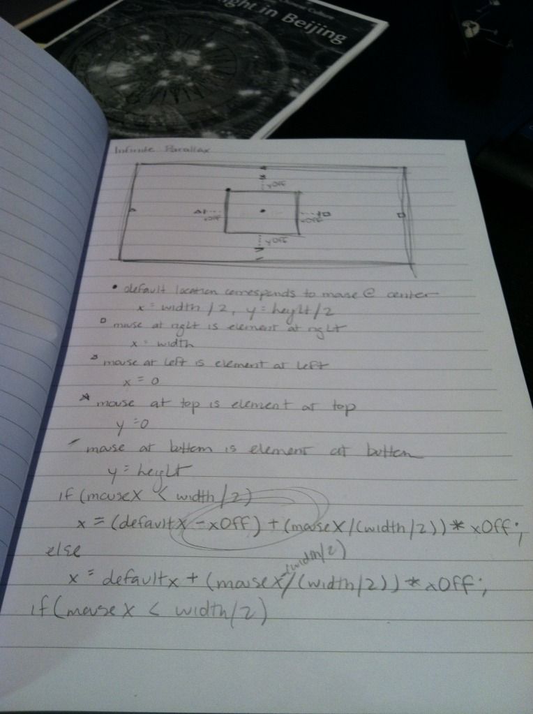
It isn’t much yet.  So far I’ve just made a test background image for the landscape, and had the image move around based on the mouse position.  When the mouse is at the top of the window, it shows the top of the background image, and as the mouse moves down, the background image moves up, so that when the mouse is at the bottom of the window, it shows the bottom of the background image.  The x-movement is kind of arbitrary right now, as I don’t know what the final image will be, and it will probably need to be tweaked based on that.

My scribbly notes
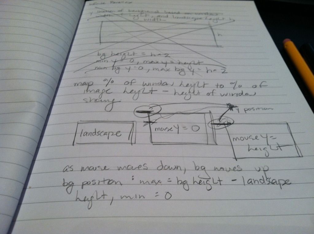
My scribbly notes

Clicking on the landscape just pops up a temporary alert I put in the function where I will be manipulating the different layers of images.  I still have my test numbers in there, so right now the landscape is showing mouseX, mouseY, and the x-position of the background image.

Next step I’m just going to put in three layers of images and play around with the x and y positions to see how far to move them for it to look okay.  Then after that, putting in random images with some random movement offsets on each, and finally removing/moving/adding layers on click!

The hardest thing will be deciding what to theme this experiment and what images to use.  I took a look at my Inspiration Pinterest board, and I think I’ve decided to use the color scheme in this pin.  Maybe a foresty theme with trees and bushes that have purple berries, and some grey bunnies or something.  Who knows!  Rosemary also showed me how to “draw” (…or rather, trace xP) in Illustrator, so I think I’ll sketch simple cute little images and trace them in Illustrator.

My first (messy) tracings!
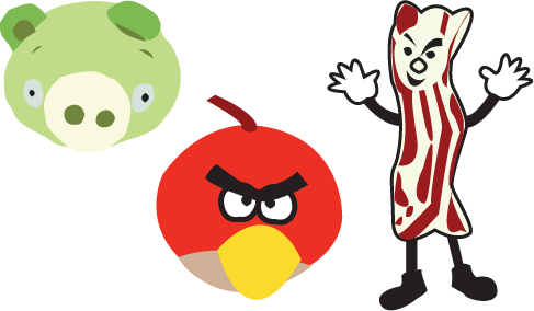
My first (messy) tracings!