I was reading these two books at once and finished them around the same time, so I figured I’d write about both at once.
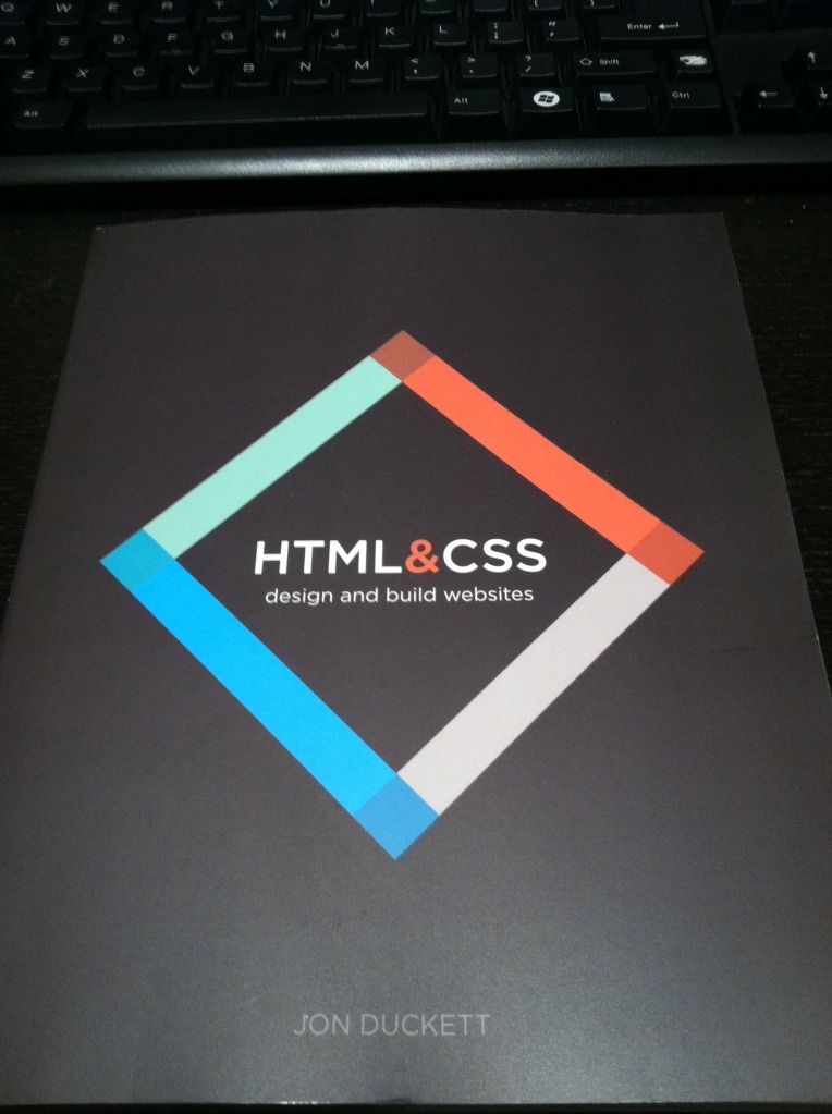
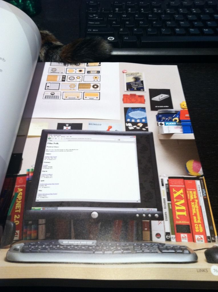
I found out about HTML&CSS by Jon Duckett because someone posted about it on Reddit. Although I already knew HTML and CSS, I couldn’t help buying it – the photos on the website make it look so beautiful! I figured that I would benefit from re-learning HTML and CSS in a structured way, since I had taught them to myself before. It’s even more gorgeous in person! The HTML and CSS are color-coded, each type of page (Introduction, Reference, Background, Diagram, Example, and Summary) has its own layout, and even the example pages (showing the result of the HTML) are beautiful.
It’s a beginner book, so it start off with just HTML. It describes how HTML works, then goes into different tags, introduced in related categories. It’s very simple and very clear, with lots of diagrams and examples. The book brings up some older HTML practices that are no longer used, but it points out that they are old, and is explaining them in case the reader comes across them when looking around the internet – I really like that it does that. Things change so quickly, but I think it’s important to still know where things came from and how things evolved. It also goes into a few new HTML5 tags, but doesn’t delve into them too deeply, and just tells the reader to look out for them. The examples of the HTML code are so pretty. Instead of simply displaying what a browser would display, there are photos of a laptop or a monitor, showing the site in a browser. The background of the photos are beautifully-decorated rooms, and it just makes looking at plain HTML a lot more enjoyable.
The second section is about adding CSS to the HTML that had already been taught. It also introduces CSS in related categories, so it’s easier to digest, and easy to follow. The example pages that are created slowly become more complicated and realistic. By the end a full web page is created. The relevant example code is color-coded and easy to follow, and the code is even available online (although I personally never checked it out).
The last section is some random website-related information, giving some quick information about the process of creating and maintaining a website, such as designing for the visitor, wireframing, visual design, and SEO.
Overall I think it’s a great book to learn HTML and CSS as a beginner, especially because it’s very visual and you are using HTML and CSS to create something visual, so it makes a lot of sense to present the material to you in well-organized and understandable visual examples. The examples aren’t contrived and are real examples of situations in which you would utilize the code. And of course, it’s so enjoyable to look at! In general I think that it’s very hard to learn coding languages just from books without trying them out, so I think it’s awesome the examples in the book are available online to play around with and explore. I didn’t check them out just because I was reading the book not to learn, but to refresh.
As I went through it, I actually learned that I lot of things I thought I knew are obsolete, and there are a lot of new tags and conventions used today that I had no idea about. It was a great refresher, and it’s made me remember how interested I’ve always been in web design and web development. I’ve decided to follow up with an HTML5 book and a CSS3 book to get caught up on the latest of HTML and CSS, and then take a look at both again from a design perspective.
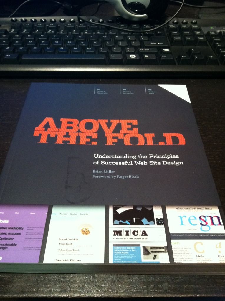
I can’t remember how I found out about Above the Fold by Brian Miller – probably some Reddit post or Quora answer – but I’m really glad I found it. Before I started working in my current team at work, I never too much thought to user experience and design, but I’ve come to realize that they’re really important, and if I don’t have to put much thought into them when interacting with a website they were probably well-done!
This book is also split into three sections. The first is Design and Typography. However it’s not limited to those topics and includes a lot of relevant information that’s useful and pretty interesting. For instance, it explains how things such as a computer’s color depth, monitor resolution, operating system, browser type, and connection speed will affect how they see your site, no matter what you do. Something I found really fascinating in this section was the Brief History of Web Design, split into Web 1.0 (1993-2002) and Web 2.0 2003-present). It included screenshots of websites from those previous years – Yahoo in 1994! Amazon in 1995! Apple in 1997! Google in 1998 (which, by the way, doesn’t look too drastically different)! It’s cool to see how much things have changed.
The second section is Planning and Usability. This goes backwards to what you should be considering before your design – the visitors, the client, wireframing, prototyping, and usability. I think this is the kind of “background” stuff website visitors never see, and never really consider. There’s a lot more that goes into a site than I thought!
The last section is Business Value, and is about SEO, ads, and marketing. Since I’m reading this book as a personal interest, I didn’t pay too much attention to this part, even though it was very interesting. For me personally, it’s good to know about, but I don’t think I would ever be making sites professionally in an environment where I would need to be an expert in these areas, just making sites in my free time for myself :)
I think this book was awesome. I got a taste of all the important things to consider when designing a site, and it was all very well-presented. Nearly every page has a screenshot of an existing site that exemplifies the concept being discussed. Not only was I learning these concepts, I got a lot of ideas and inspiration from the screenshots.
One interesting thing I noticed as I was reading the book is that I get very different impressions of a site when viewing it in a browser versus the entire length at once in a book. Seeing the entire length makes it feel more cluttered to me – a lot thrown at me at once. However seeing it at once does give me a better sense of how elements of a site tie together into one experience.
I’d suggest both of these books to anyone interested in web design. They’re both not only informative, but great to look at, easy to read, and well-designed. I wish computer science textbooks were presented like this!
