The Martian by Andy Weir

Back when I was really bored at work at my last job I got into a personally productive phase, getting very motivated and excited working on personal projects and reading a lot of books. At one point I was structuring myself so that I would work on something specific each work day – it was something like Monday is technical project, Tuesday is crafts project, Wednesday is reading, Thursday is playing a game, Friday is hanging out with Jack… I can’t remember exactly what it was (I swear I wrote a post about it but I can’t find it and spent some time getting teary over this old post about Jokulhaups instead).

However work at this job is very fulfilling and fun, and when I come home I either want to work some more or just lay on the couch doing nothing until I go do some more work. It’s drastically reduced the number of console games I play too (though I get sucked into mobile games easily, which in my mind somehow fall under “do nothing”).

Since it’s holiday break and pretend-you’ll-fulfill-your-resolutions time, I decided to try something different. I’ve stopped really reading books for a long time so I want to get back into it. The last few books I read a while ago I still haven’t written about and probably never will because I procrastinated too long and don’t remember them that well. I also recently got this huge iPad Pro that I’ve mostly been using for games.

I’m going to try writing about the book I’m reading as I read it. So this will end up more of a log than a single post, I guess, that’s posted all at once. This way I’ll get down more of my impressions as I read and have less risk of not actually posting about the book. Writing this up on the iPad will also be interesting, as it’s proving to be rather difficult – I type very fast and this feels like less than half my normal speed, what with not being able to use normal keyboard hand positioning and all the strange auto-correcting I have to go back and fix. Maybe it will force me to think more before I write, as I tend to ramble a lot. Though it’s so big that I almost may as well have pulled out my laptop to write this up on.

Anyway, on to The Martian…

We watched The Martian in 3D with D-BOX seats. It was the first time we’d tried D-BOX seats. It was interesting, but not something I’d feel like I was missing out on if I didn’t have. The best part was that they are reserved seats though, so you can come in later with a guaranteed seat (though you may need to kick out the non-D-BOX people sitting in your seat that don’t realize it’s reserved).

I liked the movie itself. Obviously at that point I hadn’t read the book (what with just having bought it today and all). It was a while ago, and I’m extremely terrible at remembering details about books or movies past a few days, so really my only impression of the movie now is that I liked it at the time. The only other strong impression I have is (not sure if spoiler) “China would never have helped!”

This will be interesting, to see differences with the movie.

Saturday, December 26th

I just bought the book today and only got 7 pages in before deciding to do a reading log (I specifically got the version that did not have a movie-inspired cover because I didn’t want to carry Matt Damon’s face around), so so far right now my only comment is that I like the tone of the writing. It feels very realistic and like how I imagine I may record the happenings if I was in that situation.

So yeah. I’m fucked. (page 7)

Got further and had some thoughts.

There are some details in the book that better explain some things from the movie, but are still a bit incredulous. For instance, the fact that each of the astronauts have two specialties… and his two specialties just happen to be the exact two that will keep him alive? The fact that he had vegetables he could plant that weren’t freeze-dried (not sure how spoiler-y I am being, so this is a bit hard to phrase), but it was only because of some very specific timing of when he would be on Mars?

Also, do real normal people say “edge case”? Because he just said “edge case”. I guess maybe because he is a scientist it may make sense? “Edge case” feels like a very programmer type of thing to say. Do other disciplines use that phrase?

I wonder if the way this is written as his daily logs was meant to be as if they are video logs like the movie, or written? I think if I had read this first I would imagine them as written logs.

Really? It’s oh-so-lucky these two things just happen to use the same voltage. Oh, this thing has a valve and I have no idea why it has a valve but thank god it has a valve because I really needed this valve! A lot of this is starting to feel very contrived.

Sunday, December 27th

I haven’t felt as skeptical about the circumstances in the book since I kept reading yesterday, so I’m feeling a bit better about the book. Perhaps it’s because it’s starting to get much more into what’s happening in Earth and not just his logs.

One thing I noticed yesterday that I thought was interesting was the use of “Ziploc” and “Hefty” as size references. I’ve been fascinated with brand names used as object names since I read a book a long time ago that capitalized “Dumpster”. It confused me because it’s just a dumpster, right? I looked it up and it turns out dumpster is what is called a generic trademark. These are brand names that have been used so much they’ve turned into the generic commonly used name for objects. Some other fascinating examples are heroin, escalator, dry ice, frisbee (auto-correct actually capitalized that for me at first), and popsicle (more here).

As a result, I tend to take note of how brand names are used. However in this book I noticed that rather than using Ziploc or Hefty to mean “bag”, they were actually used together as more familiar size references to give the reader a better sense of what Mark was doing with the bag.

One thing I have in abundance here are bags. … Some are smaller than a Ziploc, while others are as big as a Hefty lawn and leaf bag. (page 31-32)

I cut up a few Hefty-sized bags and taped them together to make a sort of tent. (page 32)

I got a Ziploc-sized sample bag and waved it around a bit. (page 36)

I’m enjoying the humor in this book. Some things are still kind of incredulous (you sent a hack half a byte at a time and he just entered it in and it just worked?) but overall enjoyable.

A career software engineer, mornings were never her forte. (page 132)

That line could be my life story.

I looked at the back cover and it says Andy Weir is a programmer – I guess that explains “edge case”.

Ah ha! They used “Popsicle” (capitalized) as a generic term! I was excited so I figured I’d stop to write a thought down.

I passed the part where China decides to help – to be honest I was a bit surprised it was in the book; I would not have been surprised if it had been added just to the movie purely for some sort of marketing purpose. In fact when we first saw the movie that was our theory on why China was in the movie at all, to appeal to Chinese audiences. The book only spends 3.5 pages talking about the Chinese space people making the decision to help. It felt kind of shallow – I still don’t believe China would ever help of its own accord, especially if no one even knew they had the ability to help.

So far it seems like the movie had stuck very closely to the book, but the scene with the Chinese space people talking actually was two men, where in the movie they had a man and a woman. I wonder if that was a ploy to get female Chinese audiences.

Monday, December 28th

I’ve continued reading, and didn’t have too much of note other than him referencing that he was typing his logs, so that answers my question of written vs. video logs.

It’s amusing to imagine all his rock morse code messages to NASA just hanging out there forever along the path he drove.

Just finished it! It was pretty good. I’m surprised how closely the movie stuck to the book (at least what I remember of the movie). I do feel like one life-threatening situation (Rover tipping over) was replaced by another (more drama when rescuing him from his makeshift rocket) though.

One thing I wish it went into more detail in was all the arguments and discussions that went into deciding to spend the time and resources on saving him. NASA is  government-funded; there would have been many arguments about the costs and benefits. I could totally see many people arguing that one life is not possibly worth the time, resources, and lost work for future missions. I could imagine it boiling down to public opinion which swayed the decision, though I’m sure many many people would disagree no matter what they did. I just wish it went into more of those practical details; it’s always the negotiations and arguments that no one plans for, even in projects at work.

Overall, it started kind of unbelievable (as in way too many lucky coincidences) then got much better. Still feel that it’s too unrealistic that China volunteered to help.

We’re going to watch the movie again tomorrow so I can compare it!

Also, not quite sure about this format of writing a log while I read. I guess this was a good book to try it on since he writes in log format. Maybe it would be easier if I had my laptop open to type it on instead of using the iPad Pro. Perhaps I’ll try it at least once more.

Tuesday, December 29th

Never mind, Jack couldn’t find a good version of the movie to download, not watching it again today.
Responsive Web Design by Ethan Marcotte

I finished this book a few weeks ago, but never got around to writing about it.  I loved it though!

Ever since I came across the idea of responsive design, I’ve been fascinated with it.  I just think it’s such a neat idea, and it seems so obvious after you hear about it.  After I finish the Infinite Parallax experiment I’m going to make a responsive layout for BaconFriedRice!  Yes, two years later, I’m finally going to actually work on it! (For real!)

Anyway, Responsive Web Design by Ethan Marcotte is amazing, especially because it is written by the guy who came up with the idea in the first place.  Just like all the other A Book Apart books, the writing tone is awesome, and the content tells you things you can do to create a responsive site right now.  He shows you how to do it by creating an example page that you can actually go view and play around with.

One thing I really like that Marcotte says is that a web designer’s canvas is the browser (page 3).  However, unlike other art mediums where the canvas is precisely selected beforehand, the browser continually changes, and you can’t rely on a consistent format, which make web design pretty challenging.  I’ve never thought of it that way before, but now I view it all in a whole new way.

Marcotte sees three ingredients of responsive web design, and breaks up the chapters accordingly: 1) a flexible, grid-based layout, 2) flexible images and media, and 3) media queries (page 9).  I won’t go too much into exactly what he says in the book, but I found it extremely helpful.  He breaks down the steps he takes to make a layout responsive, which makes it pretty easy to follow, and it seems like it’s not too hard to break into creating responsive designs.

Basically: read this book!

Also, he made an “over 9000” joke :) He put comments above some media query breakpoint examples: “Default, linear layout”, “Small screen!”, “Desktop”… and “IT’S OVER 9000”!

Just read it!

HTML5 For Web Designers by Jeremy Keith, CSS3 For Web Designers by Dan Cederholm

HTML5 For Web Designers by Jeremy Keith and CSS3 For Web Designers by Dan Cederholm are both A Book Apart books.  Even though I just recently read Introducing HTML5 and The Book of CSS3, I wanted to see how HTML5 and CSS3 would be presented “for web designers”.  Introducing HTML5 and The Book of CSS3 go through many new aspects of HTML5 and CSS3, both usable and not quite ready, and they are both really helpful in getting a good grasp of the big picture for both of them.  They both go through different categories of new features, with explanations and some basic examples for each.  They read a bit like textbooks to me, though.

HTML5 For Web Designers and CSS3 For Web Designers take more practical, use-right-now approaches.  They don’t necessarily try to thoroughly cover all the new features, but present the ones that are stable enough for you to use right now.  And both books are so short!  They were easy reads and the authors have really friendly tones.  I’m hoping the other A Book Apart books are similar!

HTML5 For Web Designers starts off with “A Brief History of Markup”.  Some of it is similar to what Introducing HTML5 mentions, but I also learned new things.  It takes a very humorous tone – I liked the following:

After HTML 4.01, the next revision to the language was called XHTML 1.0.  The X stood for “eXtreme” and web developers were required to cross their arms in an X shape when speaking the letter.

No, not really.  The X stood for “eXtensible” and arm crossing was entirely optional. (page 2)

The chapter “The Design of HTML5” was interesting to me, because it gives a background that is more that just historical facts – it gives  a glimpse into the reasoning and principles behind people’s thoughts.  For instance, it talks about some of the WHATWG’s design principles used to guide the development of HTML5.  One that caught my interest was “Priority of constituencies”, which, according to the book, says: “In case of conflict, consider users over authors over implementers over specifiers over theoretical purity” (page 10).  So apparently HTML5 is, at the core, designed for the users.  I often assume this is true for many things, when in fact they are not at all… It’s nice to know HTML5 really is designed that way!

In talking about the very loose syntax of HTML5, I came across this paragraph:

If you’re looking for a cheap evening’s entertainment, get an array of programmers into the same room and utter the words “significant white space.”  You can then spend hours warming yourself by the ensuing flame war. (jpage 15)

First of all, I probably enjoyed the phrase “array of programmers” too much.  Second, it made me try to clarify my own thoughts on white space.  I haven’t yet seriously used a language in which white space is significant (such as Python), so I can’t clearly say what I think about that, but I do know that I really like patterns and structures – any time I code, I try to make my style as consistent as possible everywhere.  I feel like theoretically I would enjoy the strictness of significant white space, but in reality I would probably get pissed off that my code broke due to something tiny I didn’t feel was important at all.

One thing I thought was interesting is the author’s approach to canvas.  I’ve seen people all over the internet so excited about it, treating it like the best thing ever… but this author is not quite as enamored with it, due to its lack of accessibility (page 27).  It’s interesting that he considers that more important than all the “cool stuff” canvas can do.

Another thing I found interesting is when the author is discussing calendar widgets.  He says, “…calendar widgets all do the same thing, but you’ll find that they’re implemented slightly differently on each site.  A native calendar widget would smooth away the inconsistencies and reduce cognitive load during the date-picking process” (page 51).  To me though, I feel like it would be weird because a native widget would be styled by the browser, and may not fit with the overall design of a site.  Which is “better”?  It seems like something would be inconsistent for the user either way, so is there really a “better” way, or is it okay either way?

I actually enjoyed CSS3 For Web Designers more than HTML5 For Web Designers.  The tone is also friendly and humorous, but the approach the author takes to examples is a lot easier to relate to and more interesting.  Also, he (Dan Cederholm) apparently coined the term “bulletproof web design” and created Dribbble (foreword)!

I like his humor a lot – “We created support groups for designers emotionally scarred by inexplicable Internet Explorer bug” (page 2).  He also has an interesting take on the critical and non-critical aspects of a site’s visual experience.  According to him, branding, usability, accessibility, and layout are critical, while interaction, visual rewards, feedback, and movement are non-critical (page 5).  I had never though of splitting aspects of a site in those ways, but with his categorizations, his critical and non-critical aspects mostly make sense to me.  I am surprised that branding is critical (though perhaps he is talking about business sites, while I mostly think of personal sites), and feedback is non-critical (I had figured that would be part of usability).

I liked the way he presented examples, and he takes a very practical, learn-by-trying approach.  For instance, when talking about timing functions in transitions, he says, “If you slept through geometry in high school like I did, don’t worry.  I recommend simply plugging in each of these timing function values to see how they differ” (page 20).  The examples were really fun to follow and made a lot of sense, because he related them all to a fictional case study (page 29).  In fact, he made the fake site available: Things We Left On The Moon.

The author brings up a good question – do websites need to be experienced exactly the same way in every browser (page 35)?  His answer is no.  From what I understand, he believes that the most basic functionality should work in every browser, but extras on top of that are not required, and you should design your site so that it degrades gracefully.  For example, if a browser can’t display the transition of text from one color to another, fine!  Just have it change color – the transition is not so important.   I think that I agree with him, although I may not agree with which exactly what aspects he thinks are important.

Also, fun fact I learned from the book – parallax scrolling originated in an arcade game (page 84)!

It may seem like I recommend every book I read ever, but that might also be because I give up and don’t finish books I wouldn’t recommend.  I definitely recommend these two books.  Originally I had been debating whether I should purchase them or not, since I already had the other books about HTML5 and CSS3.  I’m glad I did though, because although a lot of topics discussed were similar, they were approached in very different ways and I definitely learned new things.  I really like the short and quick “learn what you can use now” approach that A Book Apart books seem to take.  I’ll probably end up getting more of them (I already have Responsive Web Design!)

Introducing HTML5 by Bruce Lawson and Remy Sharp, The Book of CSS3 by Peter Gasston

Due to procrastination I am writing about two books at once again!

In planning out my Node.js experiment, I realized that to really learn Node.js, I would need to learn JavaScript for real – and to learn JavaScript for real, I would need to go back and re-learn HTML and CSS.  In re-learning HTML and CSS, I discovered I was stuck in the past and really needed to catch up to HTML5 and CSS3, which led to the purchase of these two books.

To learn about all the cool new stuff in HTML5, I decided on Introducing HTML5 by Bruce Lawson and Remy Sharp.  This book was perfect for me – it describes the cool new features of HTML5 (plus some extras) in enough detail to allow the reader to use them, assuming you are already familiar with HTML, but leaves the really in-depth information for your own further exploration.

The book includes a short history of HTML5, which was really fascinating to me.  I never realized there was so much drama and conflict behind it all – the W3C deciding to freeze HTML at 4.01 and move to XHTML 1.0 in 1998, people from Opera and Mozilla disagreeing with work on a new XHTML 2.0 specification and creating the WHATWG to create their own specification, the W3C deciding they may have been wrong and starting to use the WHATWG’s specification as the basis of a new version of HTML, the W3C finally dropping XHTML 2.0 and moving to HTML5, the tension between the W3C and the WHATWG (pages xi-xiii)… It’s like high school drama!

I also never knew how haphazardly new features get implemented in browsers, and how much competition there is among browsers.  The example the book gave is XMLHttpRequest (page xiv).  It was created by Microsoft, and to implement something similar the other browsers had to reverse-engineer it, so there was never any standard.  Browsers all implement things in such different ways – it’s so interesting how there has to be a delicate balance between specifying how browsers should handle things (such as invalid markup or errors) and browser individuality (or else all browsers would be the same and there would be no competition!).

The biggest thing I learned in reading this book is HTML’s emphasis on accessibility.  When I taught myself way back when, I had no idea – I just used it to make my page look how I wanted.  I never realized that specific HTML tags are so important, not just for accessibility, but also for search engines.  I feel like this as been increasingly emphasized recently, hence the very strong opinion these days that HTML should purely be for structure and CSS should do all the styling.  Also, apparently there are laws about a website’s accessibility?!  The book says that some old screen readers don’t handle the specification correctly, so it’s not your fault if they can’t deal with your content, but “it’s your responsibility to know your users and the law in  your area” (page 53).  It didn’t go into any further detail – does anyone know anything about that?

I also learned some interesting fact tidbits.  Apparently the HTML5 shiv was named by John Resig, but later realized he used the wrong word and really meant shim.  The name stuck, however, so now it’s known as the HTML5 shiv (page 276).  Also, apparently “even today Microsoft Internet Explorer claims to be a Mozilla browser” (page 281).  Learning more about browsers’ history really makes me understand people’s disdain towards IE!

My favorite part is the tone of this book.  Both authors use a very colloquial writing style, and there are so many little pokes and teases at each other.  Here are some of my favorite text selections:

New browser features are very exciting and some people have made websites that claim to test browsers’ HTML5 support.  Most of them wildly pick and mix specs, checking for HTML5, related WHATWG-derived specifications such as Web Workers and then, drunk and giddy with buzzwords, throw in WebGL, SVG, the W3C File API, Media Queries, and some Apple proprietary whizbangs before hyperventilating and going to bed for a lie-down. (page xvi)

HTML5 browsers must still render these dear departed elements, of course, as there are plenty of them still out there in the wild.  But you must avoid them as if they were tarantulas, zombies, man-eating tigers, plutonium sandwiches, or Celine Dion songs. (page 70)

You don’t need us to explain what our old chum id is.  But now you can begin the value of id with a digit, just like you always have been able to do with class.  Yay to the max, that’s phat, as people a quarter of my age probably say. (page 74)

Say for instance you had created a real-time charting application that tracked every time Bruce mentions his favourite pink cuddly toy on Twitter.  This charting app will plot Bruce’s sentiment against the current time – so you know if he’s happy with the colour, texture, and general feel of the thing or not. (page 270, obviously written by Remy)

To catch up on CSS3, I picked The Book of CSS3 by Peter Gasston.  To be honest I was pretty skeptical about the book at first.  The cover has a robot mannequin on it, being measured by smaller robots… what in the world does that have to do with CSS3?!  I never found out, but the book was very useful, so I guess it’s good I didn’t judge it by its cover!  This book is similar to the last – it assumes you’re familiar with CSS, and teaches you enough about the new CSS3 features to be able to use them, but doesn’t throw extraneous details at you.

I was very surprised to learn that CSS2 isn’t even an official W3C recommendation yet, and that work began on CSS3 way back in 1998 (page 2).  These things take so long!  It’s understandable though, I guess, since so many people give their opinions and they all have to agree in the end.  I wonder why CSS3 popped up as such a popular topic recently, though?  Same with HTML5, actually – at what point did they all of a sudden gain visibility?  Is it because browsers now have implemented so much of them that we can use them even if they’re not finalized?

I never realized the recommendation process was so complicated.  Working Draft, Last Call, Candidate Recommendation, Proposed Recommendation, and finally Recomendation (page 3).  I wonder what the average length of time it is for a module to make it through all the stages?  Years, probably!

I was pretty impressed with how much research seemed to have been done by the author in terms of browser support.  At the end of every chapter, there is a table listing the features discussed in that chapter and which browsers (among WebKit, FireFox, Opera, and IE) support it, which support it with browser prefixes, and which are expected to support it in a future version.  The examples in the chapters also include browser prefixes, so you know exactly which features are support in what way.

Something that made me think was the following sentence, which is related to something I mentioned earlier:

We think of web pages as having three layers: content (HTML), presentation (CSS), and behavior (JavaScript), and it’s generally understood that these layers should all be kept absolutely separate – we don’t use presentational or behavioral rules in the content layer (in other words, no CSS or JavaScript inline in the markup). (page 163)

I wonder when this shift came about?  From what I’ve understood after reading around, people make a big emphasis on separating layers precisely because people never used to do that.  Even I remember using <font> and style=”position:absolute” in my HTML.  What was it that caused this shift?  I personally do believe it’s easier to understand and maintain if everything is split.  However now the Transitions and Animations modules kind of take a step back – they add animation, which is usually seen as behavior.  I wonder how things will change now?

The book also went into some proposed CSS3 that may or may not ever come to reality.  One interesting one is the CSS Haptics proposed by Nokia (page 248).  I can’t really wrap my head around the fact that they are simultaneously filling in the gaps of features web developers wanted long, long ago and had to implement with workarounds (such as rounded corners done with images), and thinking way far ahead to propose CSS that defines the haptic feedback of a touchscreen.  The example was “haptic-tap-type: latched-button-down”.  Will a touchscreen one day really be able to make me feel like a physically pushed a button down?!  I still can’t get my brain around it.

Fun fact – to get around a certain @font-face drawback, you need to add a “null” value which only needs to be a single character.  It’s become convention to use a smiley face! (page 55)

These two books were awesome, and I definitely learned a lot.  I’ve now already started on my next set of books (which will most likely be written about together, since I’ve already finished one of them but don’t feel like writing about it yet…) to continue my learning for the Node.js project.  I’m also working on a separate “project” at the same time though – getting through Seven Languages in Seven Weeks by Bruce Tate.  All this stuff is so exciting!

The Historian by Elizabeth Kostova

I’m in Boston right now!  Well, really Newton, but I flew into Boston.  Came here for work on Tuesday and I’m leaving tomorrow morning.  I’ve been able to catch up on my reading while on the plane here and also in the middle of the last three nights while I was up until 2:00am or 3:00am somehow still jetlagged.

I borrowed The Historian by Elizabeth Kostova about a month ago when Jack and I checked out the Santa Clara library for the first time.  I hadn’t been to a library for years, and this one was pretty awesome.  Way back in middle school the library I went to in Idaho had self-checkout machines, but I thought it was cool that the ones at the Santa Clara library uses RFIDs instead of scanning the barcodes.  It was kind of funny to watch Jack trying and failing to check out his book by carefully lining the barcode under the light, and then me just taking it from him and doing it for him by just throwing the book randomly on the machine.

I started in the fiction section first, which is where I picked up The Historian.  My method of selecting books is to go down each aisle one side at a time and just scan for interesting titles.  If there’s an interesting title, I pick it up and look at the cover and description on the back.  If the book still has my attention, then I’ll flip through and read a few paragraphs just to make sure I like the author’s writing style.  Kind of a superficial way of selecting books, but with so many choices in a library there’s not really a more efficient way to do it!

I decided to borrow The History because the back cover description made it sound like a mystery, and I like mysteries.  I’ve also realized lately that I like historical fiction, which is what this also sounded like.  When I got home and started reading, I was surprised to discover it was about Dracula.  I couldn’t figure out for a while how I could miss the main subject of the book, but  then I realized that there was a library barcode covering part of the back cover description and I never read the “praise” quotes on books, which both referenced Dracula and vampires.  At least it was a good surprise!

I really liked this book.  It’s historical fiction but written from the point of view of historians in a (relatively) modern time studying history, in this case about Dracula, rather than from the point of view of those periods in history themselves.  This was pretty cool to me, because they were unraveling a mystery through research of different historical sources, and it spanned hundreds of years.  Although it was fiction it was fascinating to see the small links and references the author created throughout time.

Another reason I really liked this book is because of the way the story is told.  There’s the story of the main character, which is told in first-person, but then you find out the rest of the story with her through the stories and letters of multiple people, which are all interweaved, both in who the story/letter is from and in time.  They’re also presented in chunks that are exciting and fun to read, but also leave you hanging and waiting for more.  I haven’t read a book in a long time like this, where I ended each chapter wanting to immediately jump to the next no matter how late it was or where I needed to be.

My only problem with the book was that the telling of the story through letters wasn’t 100% believable to me.  In the case of the letters from her dad, they were worded too much like a novel – too much detail, too many exact quotes, too specific about exactly how he felt, too intimate.  The letters were supposed to be written years after the events happened and written for his daughter to read – I really can’t imagine a person remembering exactly what every single person said, or even telling his daughter about how he and her mother spent their time together in a  hotel.  After a while I forgot it was a letter and just treated it as a first-person part of the book, but the fact that it was a letter from her dad was pretty important, so I don’t think that was the intended reaction.  To be fair, it would have been really hard to tell the story without giving that much detail.

It’s been hard to write this, because I have no idea how much I can say without giving things away.  I suck at writing reviews…

HTML&CSS by Jon Duckett, Above the Fold by Brian Miller

I was reading these two books at once and finished them around the same time, so I figured I’d write about both at once.

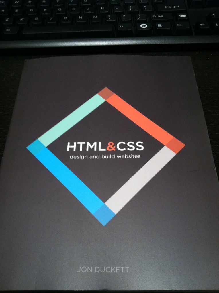
I found out about HTML&CSS by Jon Duckett because someone posted about it on Reddit.  Although I already knew HTML and CSS, I couldn’t help buying it – the photos on the website make it look so beautiful!  I figured that I would benefit from re-learning HTML and CSS in a structured way, since I had taught them to myself before.  It’s even more gorgeous in person!  The HTML and CSS are color-coded, each type of page (Introduction, Reference, Background, Diagram, Example, and Summary) has its own layout, and even the example pages (showing the result of the HTML) are beautiful.

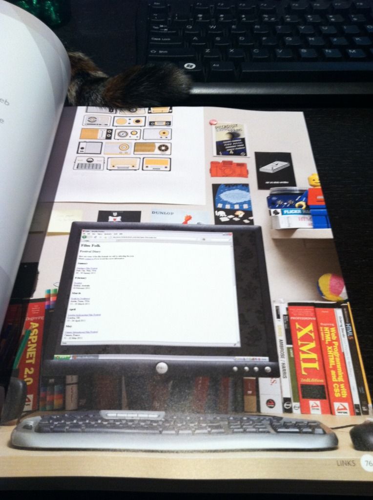
It’s a beginner book, so it start off with just HTML.  It describes how HTML works, then goes into different tags, introduced in related categories.  It’s very simple and very clear, with lots of diagrams and examples.  The book brings up some older HTML practices that are no longer used, but it points out that they are old, and is explaining them in case the reader comes across them when looking around the internet – I really like that it does that.  Things change so quickly, but I think it’s important to still know where things came from and how things evolved.  It also goes into a few new HTML5 tags, but doesn’t delve into them too deeply, and just tells the reader to look out for them.  The examples of the HTML code are so pretty.  Instead of simply displaying what a browser would display, there are photos of a laptop or a monitor, showing the site in a browser.  The background of the photos are beautifully-decorated rooms, and it just makes looking at plain HTML a lot more enjoyable.

The second section is about adding CSS to the HTML that had already been taught.  It also introduces CSS in related categories, so it’s easier to digest, and easy to follow.  The example pages that are created slowly become more complicated and realistic.  By the end a full web page is created.  The relevant example code is color-coded and easy to follow, and the code is even available online (although I personally never checked it out).

The last section is some random website-related information, giving some quick information about the process of creating and maintaining a website, such as designing for the visitor, wireframing, visual design, and SEO.

Overall I think it’s a great book to learn HTML and CSS as a beginner, especially because it’s very visual and you are using HTML and CSS to create something visual, so it makes a lot of sense to present the material to you in well-organized and understandable visual examples.  The examples aren’t contrived and are real examples of situations in which you would utilize the code.  And of course, it’s so enjoyable to look at!  In general I think that it’s very hard to learn coding languages just from books without trying them out, so I think it’s awesome the examples in the book are available online to play around with and explore.  I didn’t check them out just because I was reading the book not to learn, but to refresh.

As I went through it, I actually learned that I lot of things I thought I knew are obsolete, and there are a lot of new tags and conventions used today that I had no idea about.  It was a great refresher, and it’s made me remember how interested I’ve always been in web design and web development.  I’ve decided to follow up with an HTML5 book and a CSS3 book to get caught up on the latest of HTML and CSS, and then take a look at both again from a design perspective.

I can’t remember how I found out about Above the Fold by Brian Miller – probably some Reddit post or Quora answer – but I’m really glad I found it.  Before I started working in my current team at work, I never too much thought to user experience and design, but I’ve come to realize that they’re really important, and if I don’t have to put much thought into them when interacting with a website they were probably well-done!

This book is also split into three sections.  The first is Design and Typography.  However it’s not limited to those topics and includes a lot of relevant information that’s useful and pretty interesting.  For instance, it explains how things such as a computer’s color depth, monitor resolution, operating system, browser type, and connection speed will affect how they see your site, no matter what you do.  Something I found really fascinating in this section was the Brief History of Web Design, split into Web 1.0 (1993-2002) and Web 2.0 2003-present).  It included screenshots of websites from those previous years – Yahoo in 1994!  Amazon in 1995!  Apple in 1997!  Google in 1998 (which, by the way, doesn’t look too drastically different)!  It’s cool to see how much things have changed.

The second section is Planning and Usability.  This goes backwards to what you should be considering before your design – the visitors, the client, wireframing, prototyping, and usability.    I think this is the kind of “background” stuff website visitors never see, and never really consider.  There’s a lot more that goes into a site than I thought!

The last section is Business Value, and is about SEO, ads, and marketing.  Since I’m reading this book as a personal interest, I didn’t pay too much attention to this part, even though it was very interesting.  For me personally, it’s good to know about, but I don’t think I would ever be making sites professionally in an environment where I would need to be an expert in these areas, just making sites in my free time for myself :)

I think this book was awesome.  I got a taste of all the important things to consider when designing a site, and it was all very well-presented.  Nearly every page has a screenshot of an existing site that exemplifies the concept being discussed.  Not only was I learning these concepts, I got a lot of ideas and inspiration from the screenshots.

One interesting thing I noticed as I was reading the book is that I get very different impressions of a site when viewing it in a browser versus the entire length at once in a book.  Seeing the entire length makes it feel more cluttered to me – a lot thrown at me at once.  However seeing it at once does give me a better sense of how elements of a site tie together into one experience.

I’d suggest both of these books to anyone interested in web design.  They’re both not only informative, but great to look at, easy to read, and well-designed.  I wish computer science textbooks were presented like this!

The book that started it all: How I taught myself HTML in 4th grade

I got my new book HTML&CSS in the mail yesterday.  It’s a very basic introduction to HTML and CSS, but I got it even though I know both because it is absolutely gorgeous.  I wish more books taught like this – I’ve actually been searching for more books on web design like this.

Anyway, as I started reading through it, I realized that a lot of HTML I thought I knew is obsolete.  For instance, apparently using <a name=”blah” /> is now obsolete in HTML5, and you should instead specify anchors for links with id attributes.  I didn’t even know you could specify anchors with id!  At that point I realized that my HTML is way outdated.

Why?  Because the HTML I know is what I taught myself from a book in 4th grade.  After this one semi-structured introduction to HTML, everything else I picked up as I needed it, and I definitely haven’t been keeping up with new specifications.  I have a very haphazard knowledge of HTML, with a lot of gaps.  Same with CSS – I don’t think I even bothered with CSS for years because that intro book never mentioned it.  I’ve definitely been able to get by with what I know, but I think it’s time for a more structured refresher – and to get myself updated to 2012!

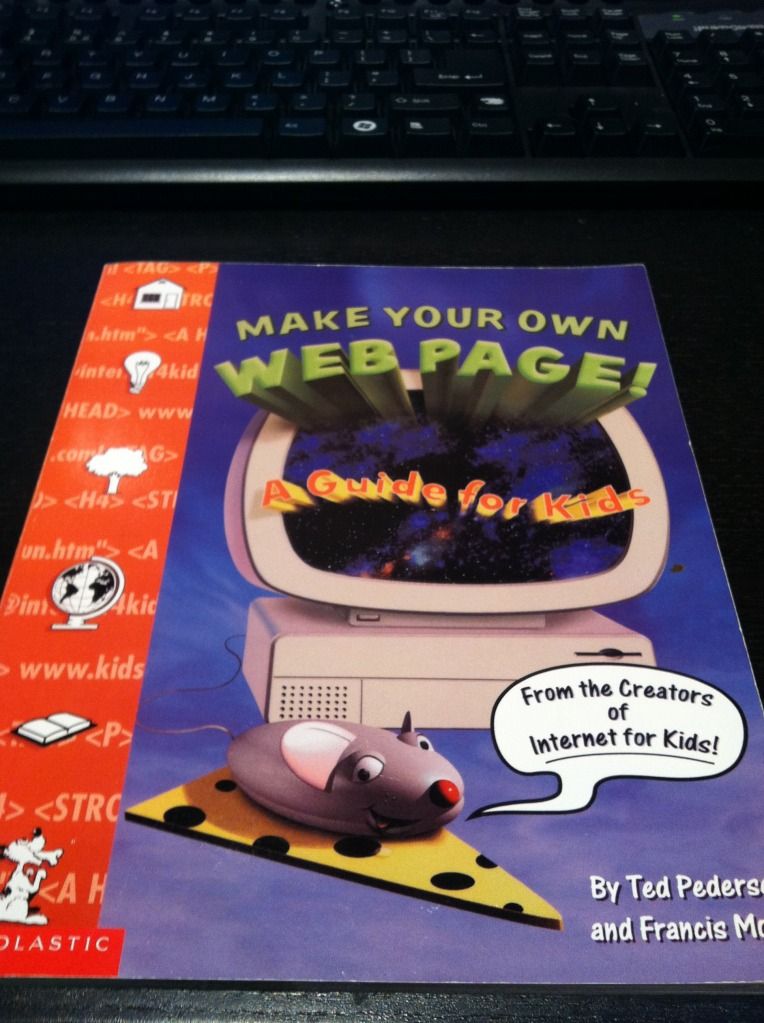
I was surprised to find that I actually had that book from 1998 (14 years ago!) in my bookshelf.  I must have missed it when I was unpacking – otherwise I would have reminisced over it for hours.  Take a look at how awful it looks:

I got it from a book order in 4th grade.  Remember those?  I was always so excited to pick out new books to get.  I have no idea what possessed me to get this book, but I’m glad I did, because I’m pretty sure this book is the reason I’m a software engineer today.

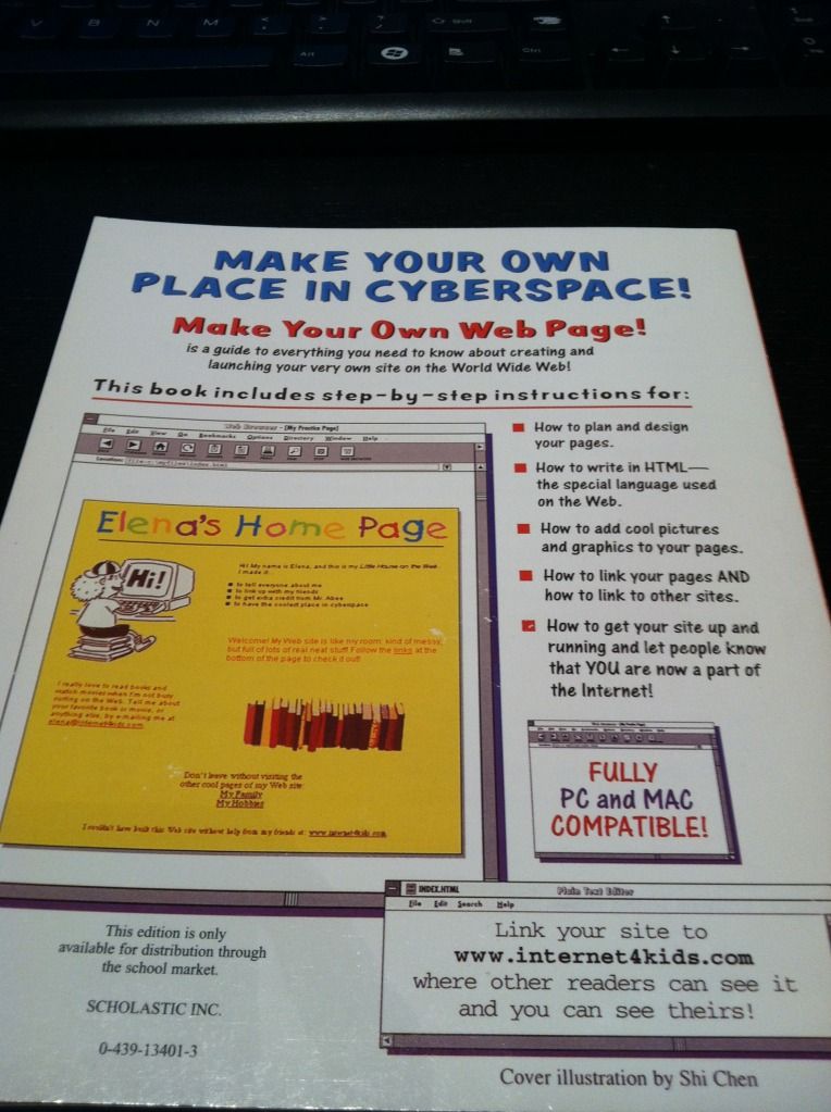
Here’s the back cover.  I cringe just looking at that example site.

I’ve already checked, that website doesn’t exist any more.

I’ve been on a book-buying kick lately, mostly about web design.  I figure the money will be worth it in the long run since I’ll be learning something I have a lot of interest in, and I haven’t sat down and read for a long time.  I still have five or so fiction books in my bookshelf that I haven’t gotten to, but at this point in time I’m more interested in learning.  And reading is dying out!  Why don’t people relax and just read any more?  That used to be all I did when I was little.  Now instead of staying up really late reading I stay up really late browsing the Internet.

The HTML&CSS book is so pretty.

Even when they show the example pages that correspond with each code snippet, they don’t just show the page – they display them on different monitors in beautifully decorated rooms.  I’ve even been getting some book suggestions from the books they show in the background.

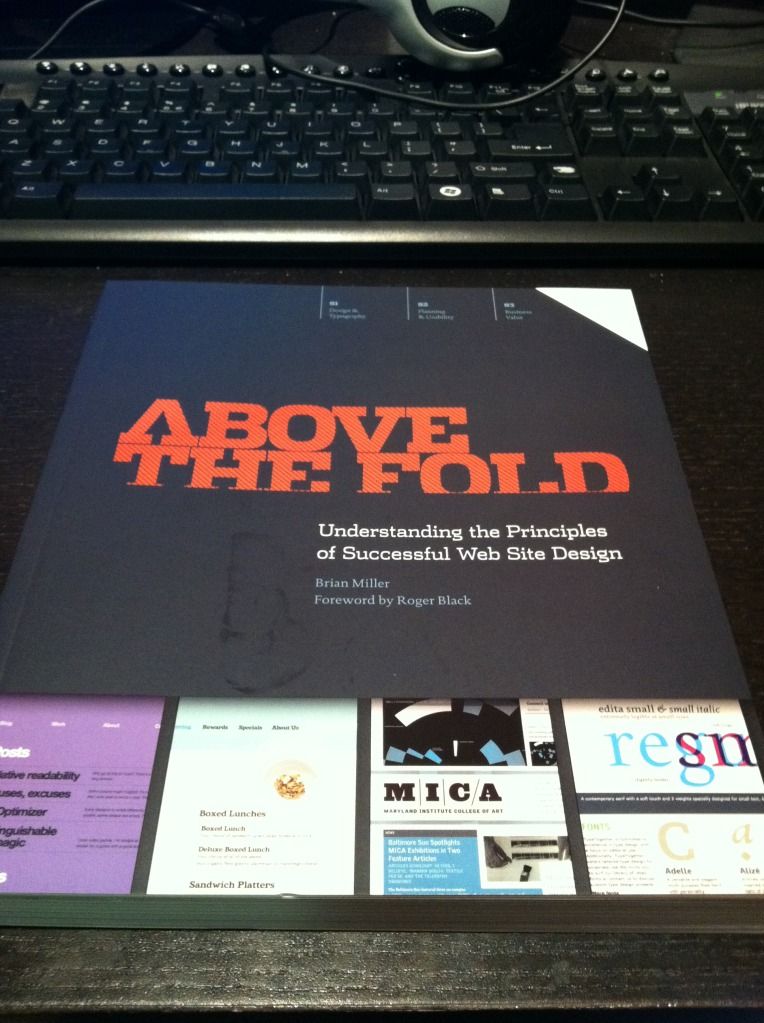
I also got Above The Fold a few days ago.  It’s also really pretty, and there’s a lot of fascinating background in it.  I never thought about the fact that tabbed browsing was based on file folders, although it seems obvious now that I know.  It talks about the structure of web pages, but it shows a lot of them full-length.  Web pages look so different when you look at them full-length versus the height of your browser.  They feel so much more cluttered to me when I see them full-screen – but then I guess that’s the whole reason the “fold” is important!

I’d also been reading The Design of Everyday Things before I got into this big book kick, because my user experience friend recommended it.  Before I started work on my current team I never thought about user experience at all – but now it seems so important.  I guess if I don’t have to think about the experience of doing something while I’m doing it, it was probably designed well enough that it was natural and made sense.  On the other hand, the book says that when something goes wrong, people tend to blame themselves rather than bad design.  I don’t think I believe that 100%, because some people are just retarded, but if the majority of people have difficulties, something is probably wrong.

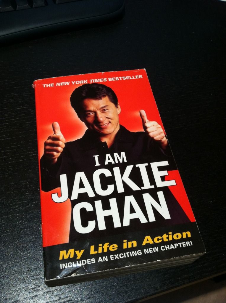
Another book I recently bought but haven’t started is a little different… I got I Am Jackie Chan, for no reason other than that Jackie Chan is awesome.  Sadly, I had to get a used book because they apparently don’t print it any more.

I’ve decided to set aside a specific amount of money each month for my “splurgy” purchases, and these books fall into them.  I’ve already ordered Responsive Web Design – now that people browse from phones so much a responsive site is pretty much expected.  Here are some other books I’ve decided to buy so far, in the order I want to get them:

After I read more I’m going to stop being lazy and actually design BaconFriedRice instead of using pre-made templates.  Yes, I’ve been saying that for a long time, but now that I’m reading all these I want to do it right.  I’m excited to get to that point!  Now off to read some more!