Wedding site part 1: Getting started
Now that we have a date and venue, I can start really working on our wedding site!
As of now there’s still nothing on it, just some piggies and a coming soon message. However, we’ve decided to do a one-page site with fancy parallax effects. I’ve never done anything like that before, so this will be fun. The goal is to have it done by August 15th, so it will be ready when we send save the dates the next week. (Assumed in that goal is that we’ll have save the dates designed and printed by then – we’ll see…)
I found some pretty neat one-page parallax wedding sites as inspiration:
- Judy and Z – I like the way the navigation bar works in this one. It starts at the bottom of the main section, then sticks to the top as you scroll down. It also changes the color of the link to the section you’re currently looking at, so you know where you are. Something I’m kind of iffy about is that in some sections, you have to click something to see more – if it’s one big page, I’d rather it’s consistently one big page you can scroll smoothly through, without needing to stop to get information. I am going to do that for a photo section though – although it will at least give you a preview of some photos, and you can interact if you want to see more. In the case of the Judy and Z site, there is no information in, for example, the “About Us” section unless you click.
- Casper en Danel – I can’t read anything in this one, but I thought the the timeline section was neat, with the text and photos coming in from the sides as you scroll. I feel there’s a little too much movement though; it takes half of my screen height for the text to finish moving from the edge of the screen to its final position, so my eyes have to move a lot to try to read.
- Vince and Mars – This one is cute! I like the parallax clouds/stars and change with your mouse. I also like the cute header with the navigation under it; however once you scroll it kind of gets in the way. On my screen, that header takes up half the height, so as I scroll I can only use the other half to see the content. I think I would like to do something like this with a cute header and navigation underneath, except that instead of having the entire header + navigation stick to the top, only have the header stick to the top – kind of like the first site above (Judy and Z).
- Julia and Artem – This one is also so cute! I love the hot air balloon idea, and that it lands when you get to the bottom. This one, like the Casper en Danel site, also has text fly in from the side when you scroll. However, it’s much easier to read because when it comes in, it very quickly reaches its final destination while it’s still near the bottom of my screen, so my eyes don’t need to move as far (only up and down!). I just also love that at the bottom, it says “Design by the bride, programming by the groom”.
- Helen and Josh – So unique! It’s kind of the opposite of the hot air balloon landing – you start at the base of a tree, and scroll up to “climb” it. This one doesn’t seem as practical though, as it doesn’t have any actual wedding information.
- Jess and Russ – The text was kind of small and hard to read, but I really like the keyboard and moves into place as you scroll. I also like the letter that slides out of the envelope at the bottom for guests to enter and RSVP. Something about the art made it a little creepy though…
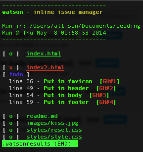
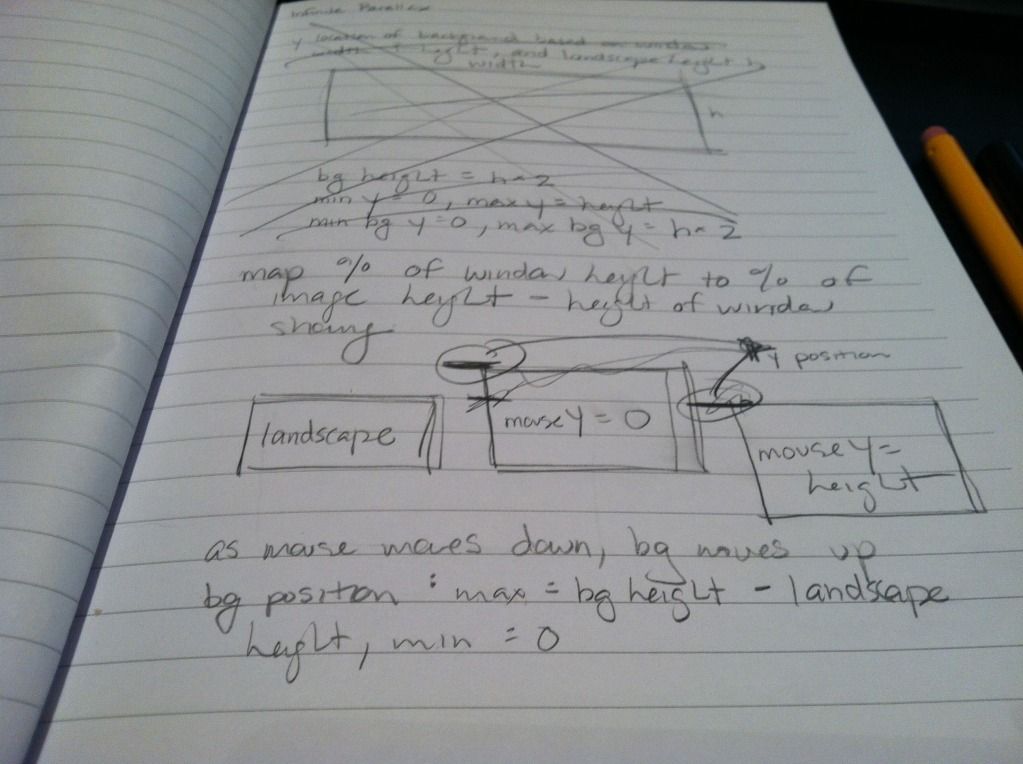
So now we’re sketching out ideas of what we want things to look like, and I’m also putting together a skeleton. I’m going to keep everything on GitHub; I’m also going to take this opportunity to try using watson (apparently not capitalized)! I found it a while ago and wanted to try it out but wasn’t working on any personal projects – you can add tags to your code, and it will pull them out and even add them as issues on GitHub! I had a bunch of issues trying to get it working – I tried both the ruby and perl versions, and had a bunch of missing dependencies, things that weren’t high enough version, etc. I finally got it to work though, and am trying it out now.
It’s kind of irritating for HTML because it takes the ending “–>” as part of the description of the tag. It does specifically list that it supports HTML though, so maybe I’m just doing something wrong? I’m also having trouble getting it to connect to GitHub, hopefully I can get that sorted out soon.
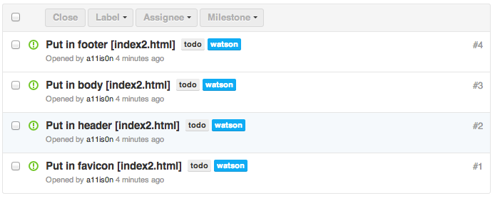
…and never mind. Apparently the version I installed as a RubyGem was not the latest version. Grabbed the latest version from GitHub and everything is awesome now. I realized it when I tried to set my own tag format as described on GitHub, but my version said it was an unknown setting. It successfully added my 4 todos to GitHub as issues! Hooray! This is neat.
Bonus: In the course of looking up parallax examples, I found Flat vs Realism. I don’t know what to feel about it.


